Information architecture, Prototyping
DigitalRev Webstore Re-Design
The Problem
This is project of redesigning the e-commerce web layout of DigitalRev. Since the website was implemented years ago, the look has inevitably become outdated and it has quite a number of fatal UX issues:
- It is not responsive at all and users may have a lot of trouble viewing it on mobile devices
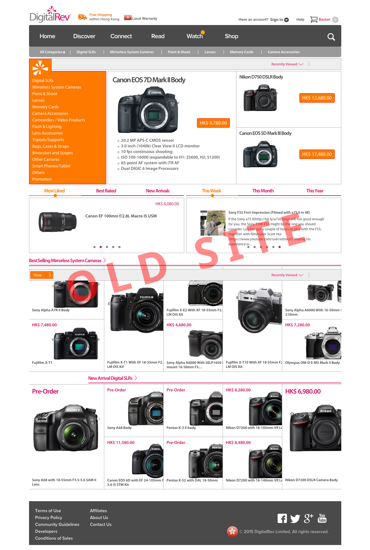
- Users are hit preemptively with too much information when they arrive at the landing page, however not much from which are really useful to them
- The site lacks a proper hierarchy of information, cameras are arranged somewhat randomly. Though this issue is more of an information architecture/business problem while not much can be done on the design side, this issue also result in a rather poor site navigation
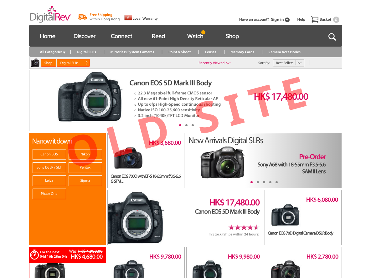
- It does not have a well structured filter so users will need to take more time to find what they want
- The infinite scrolling treatment on the category page is in fact unnecessary, since only discontinued products are showing upon the end of each category, which are not very useful to shoppers but also it adds up too much vertical space; plus users won’t be able to access the footer with infinite scrolling
The Solution
A new design is coming up, mainly focuses on improving the following aspects:
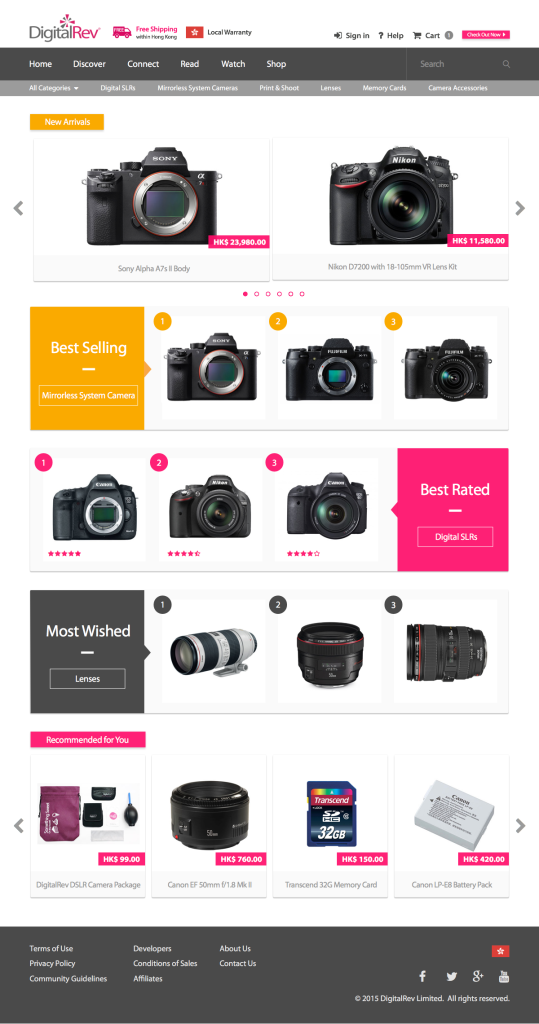
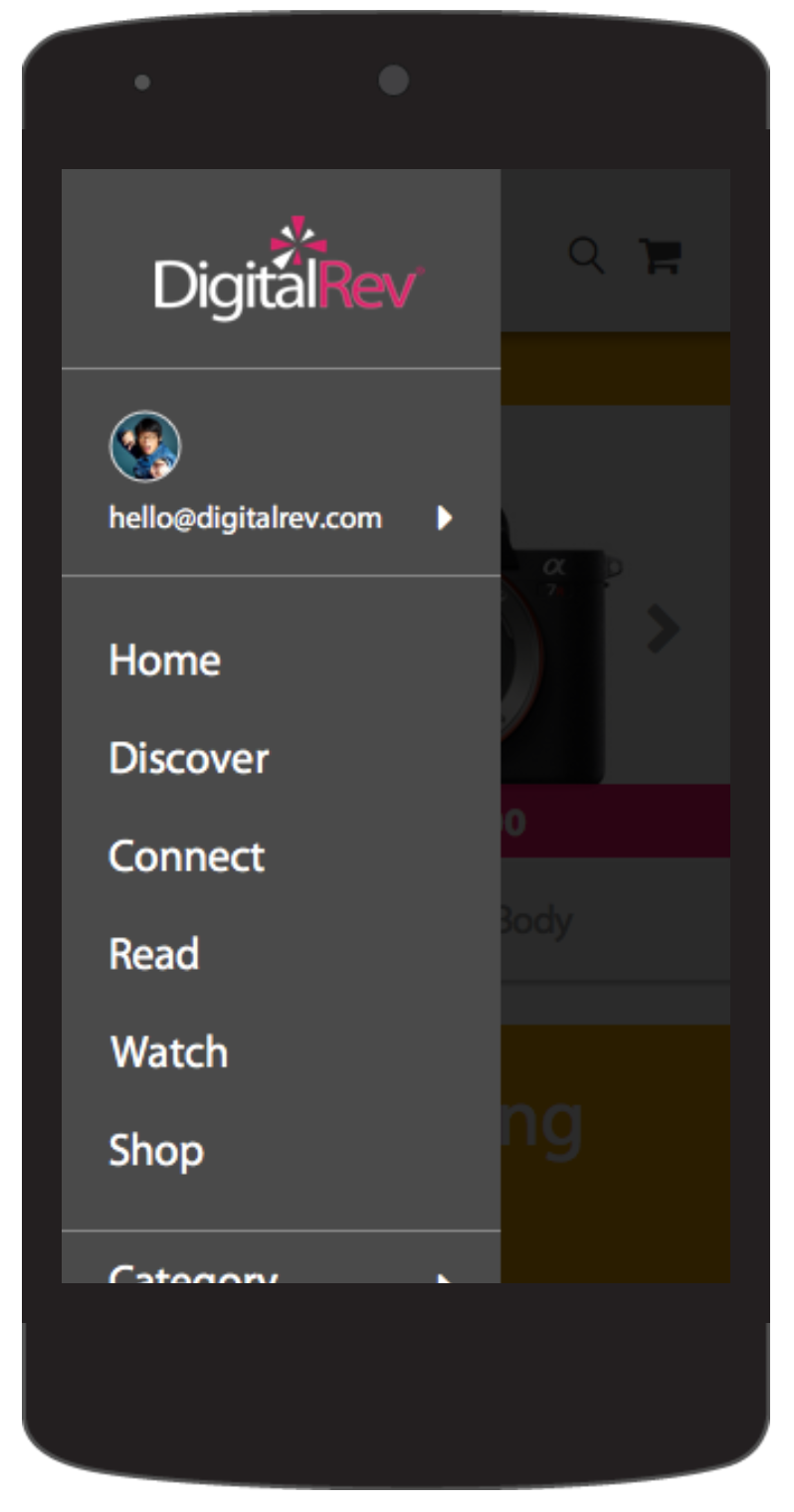
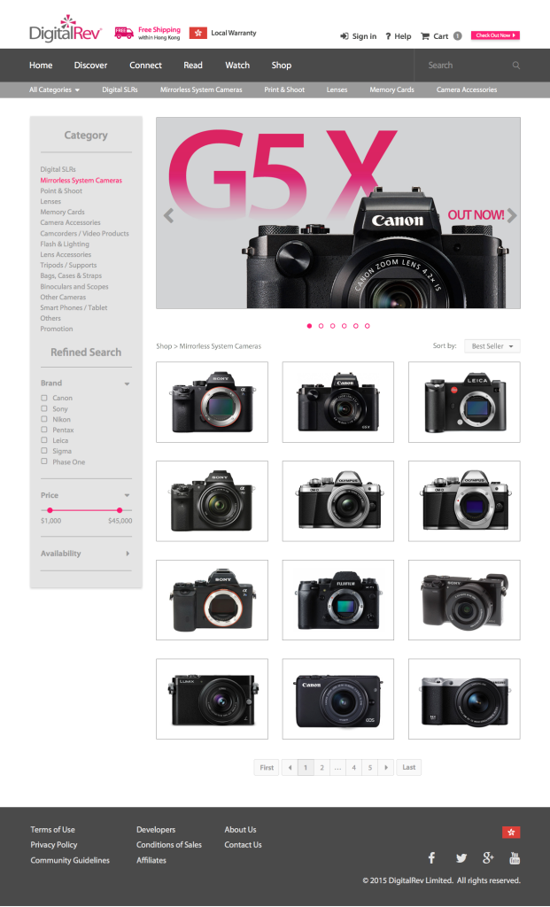
- The new responsive design is viewing-friendly on various devices such as desktop, tablet and also mobile
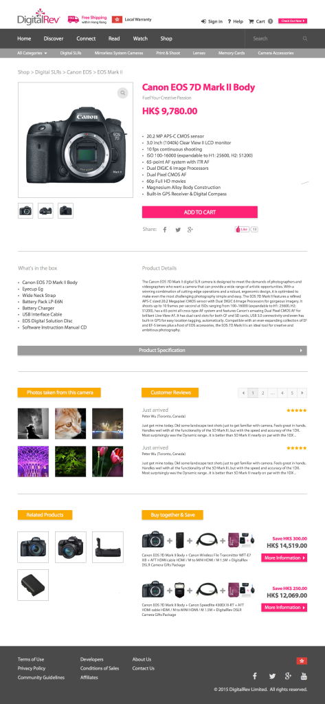
- New, familiar and modern design patterns are introduced – mainly “material design” from Google and the “card” concept of arranging information
- Only useful information will be put on the page and also product shots are kept at a minimum per row on desktop page
- Add a filter feature to let users narrow down information they want
- Use pagination instead of infinite scrolling to let users have a more clear picture to know how many products there are in a specific category and also how many products they have viewed
A Glimpse of the Old Design
And…the New Design
Home Page
Category Page
Product Page
